Grab n' Cook
An app that provides quick, nutritious recipes tailored to every skill level, helps students shop based on transportation access, allows for easy budgeting, and offers AI-powered cooking guidance for students.
My Role
UX Designer and Researcher
Timeline
August 2025 - December 2025
Skills
Interaction Design, Usability Testing, Interviews, Prototyping
Background
Grab n' Go was a semester long project for the class Introduction to Interaction Design (SI 582). My team and I were tasked creating an interactive high fidelity prototype of an app or website.
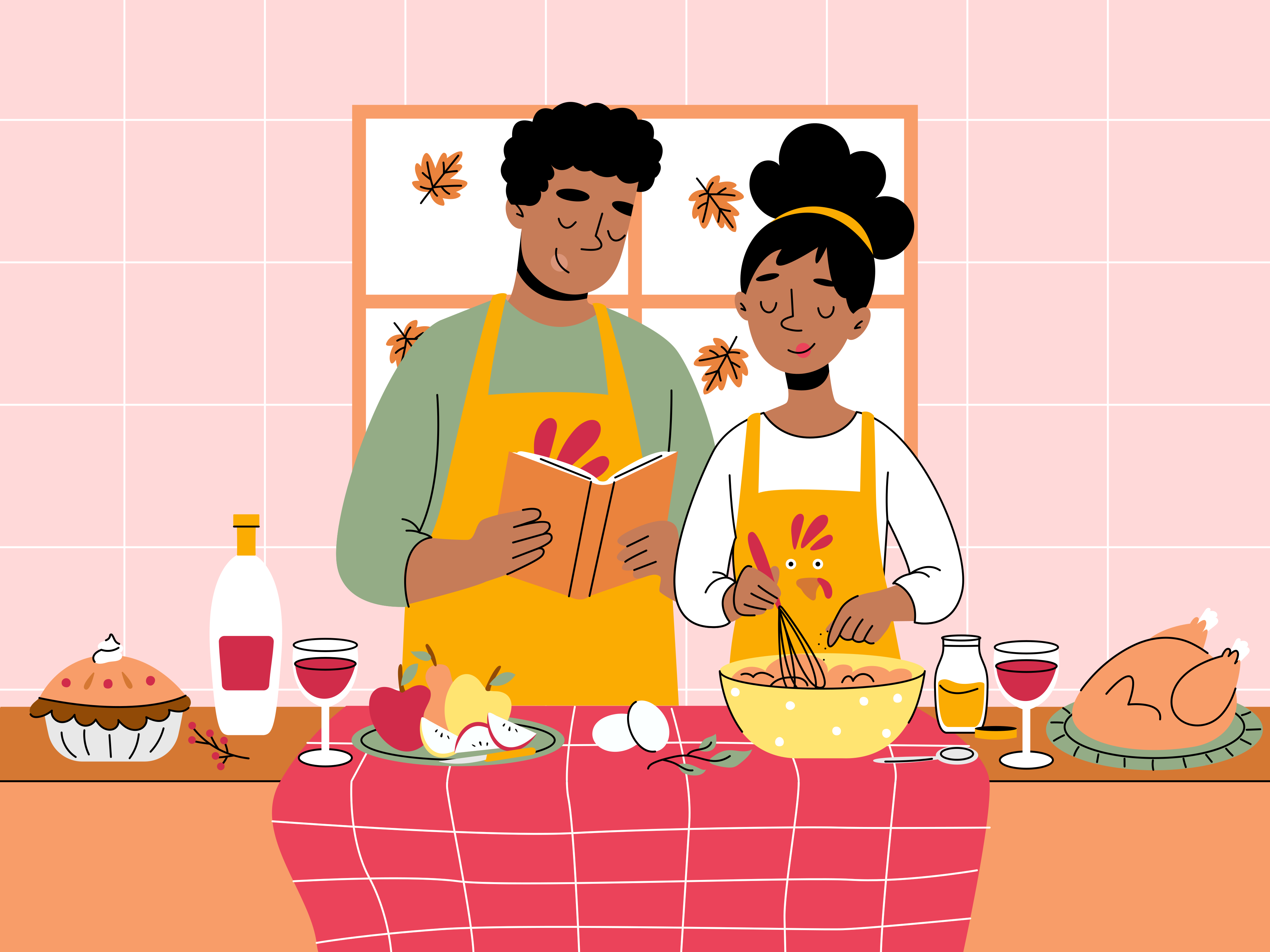
We chose to design an app with the theme, Eating Well, catered towards college students because it is a well known stereotype that college students struggle with eating well. There are apps that share this goal, however, most are not catered towards college students.
We chose to design an app with the theme, Eating Well, catered towards college students because it is a well known stereotype that college students struggle with eating well. There are apps that share this goal, however, most are not catered towards college students.
Problem
College students struggle to balance healthy eating with their busy schedules, limited cooking skills, having to grocery shop for one person, and transportation constraints. Many people skip meals or rely on takeout, which can impact their health and budget.
How might we help U of M students make healthy and quick meals according to their personal needs?
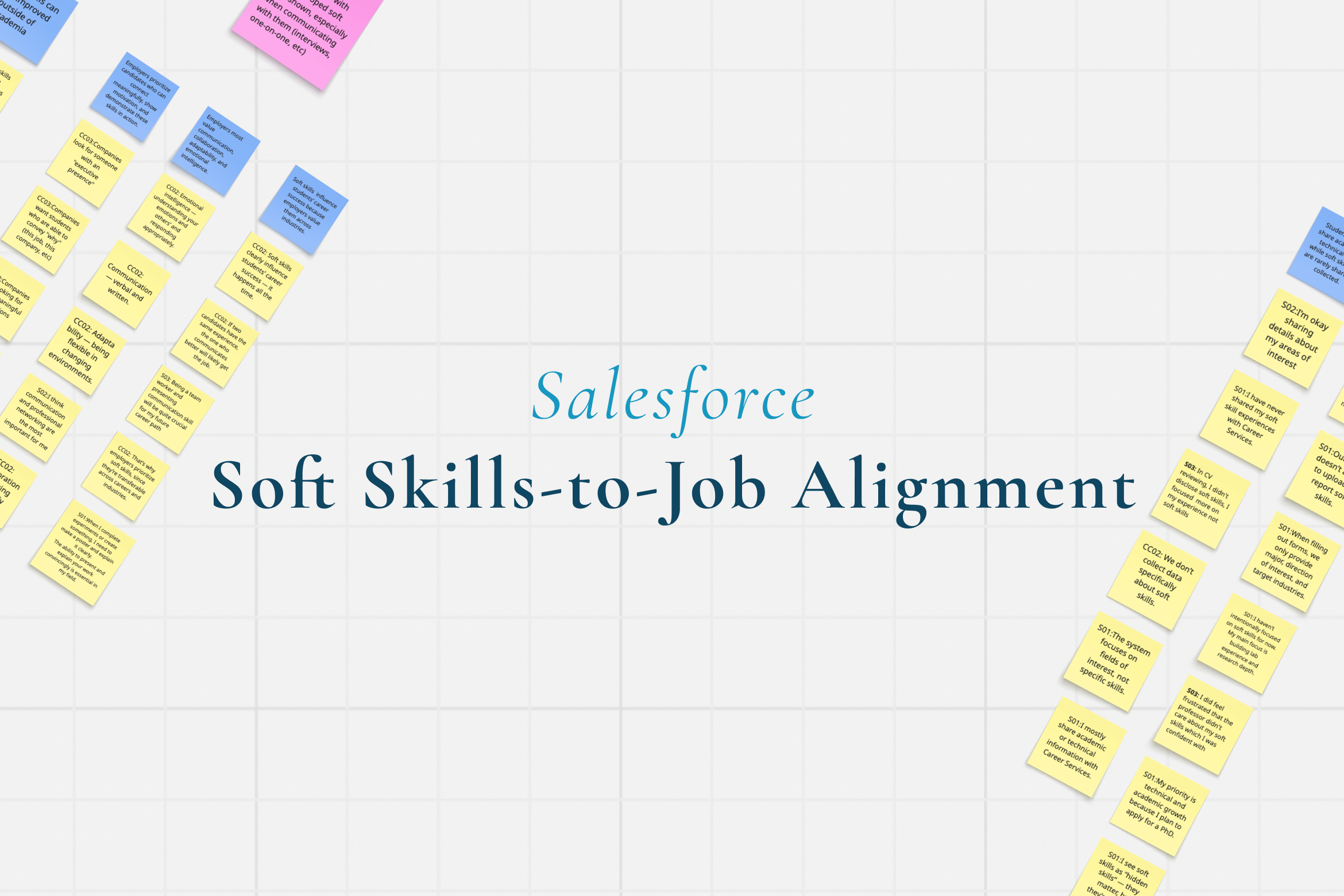
Research
My team and I conducted in-depth interviews with the following demographics:
👥 8 students interviewed
🏠 Mix of on/off-campus housing
🚗 Varied transportation access (car, bus, Uber/Lyft)
🍳 Cooking frequency: 0-3 times daily
🛒 Shopping frequency: 2x/week to every 2 weeks
🏠 Mix of on/off-campus housing
🚗 Varied transportation access (car, bus, Uber/Lyft)
🍳 Cooking frequency: 0-3 times daily
🛒 Shopping frequency: 2x/week to every 2 weeks
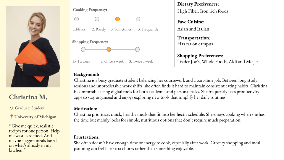
Based on that, we came up with two main User Personas:
While both students, one persona tended to cook and grocery shop less frequency (David) while the other was more frequent with cooking and shopping (Christina). College students fall on a spectrum regarding cooking ability and grocery shopping frequency, and we wanted to be inclusive of all students.
.png)
Key Insights
In our interviews, we found three main themes that stood out to us:
Hard to Balance Health and Time
Quotes from participants:
"I'm really busy, so I need meal recommendations that are quick." — Student
"Recently I've been prioritizing protein, also prioritizing fiber and eating whole foods that just nourish me for the whole day."
— Student
"I'm really busy, so I need meal recommendations that are quick." — Student
"Recently I've been prioritizing protein, also prioritizing fiber and eating whole foods that just nourish me for the whole day."
— Student
Transportation Shapes Grocery Behavior
Quotes from participants:
"Twice a week, and take Uber."
— Uber-using student
"Once a week, usually Friday night. I bus there, stock up for the week, and then carry it all home like a mule."
— Bus-using student
"Since I have a car, I'll just drive to Meijer or Walmart and grab what I need. It's usually quick in and out."
— Car-owning student
Cooking Confidence Drives Frequency
Quotes from participants:
"Pretty much twice a day, breakfast and dinner."
— Student with more cooking experience
"Honestly, almost never. I'm terrible at cooking. My mom usually sends me food from home that I freeze and thaw during the week."
— Inexperienced cook
"Pretty much twice a day, breakfast and dinner."
— Student with more cooking experience
"Honestly, almost never. I'm terrible at cooking. My mom usually sends me food from home that I freeze and thaw during the week."
— Inexperienced cook
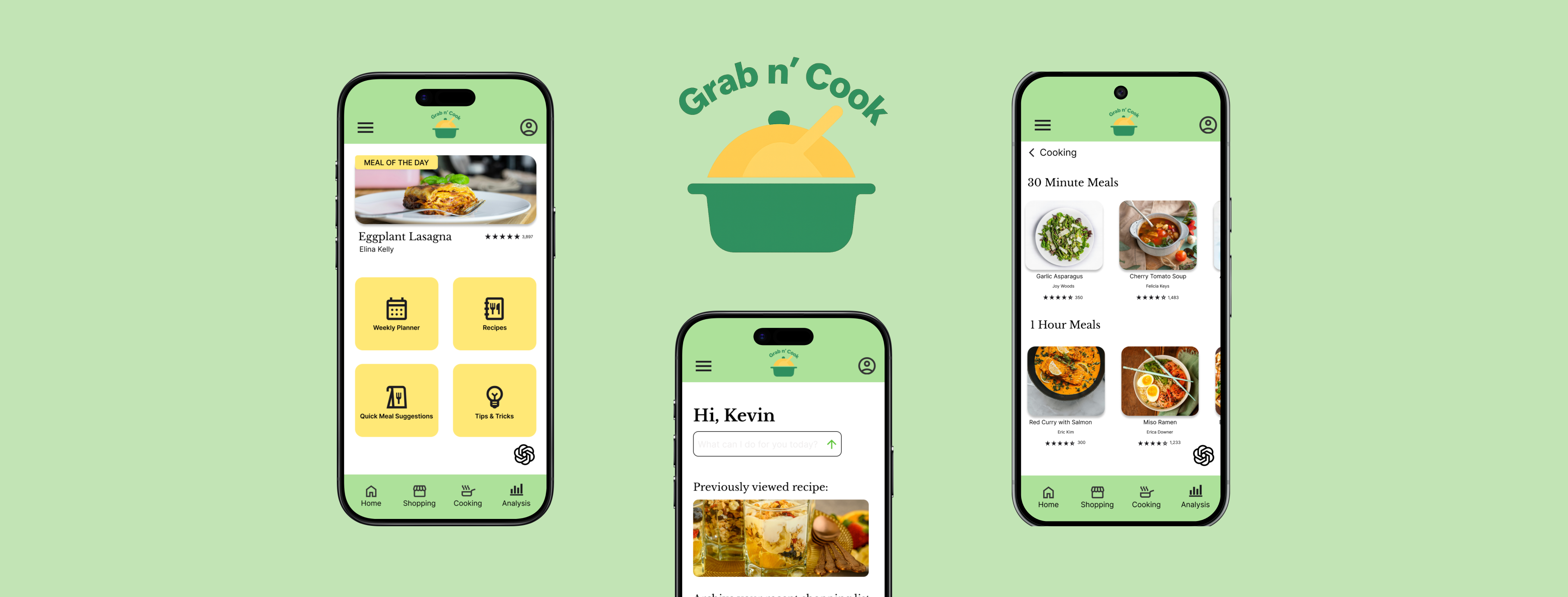
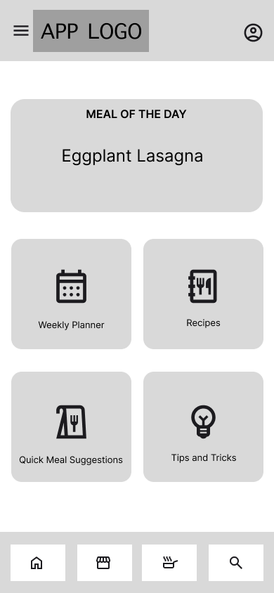
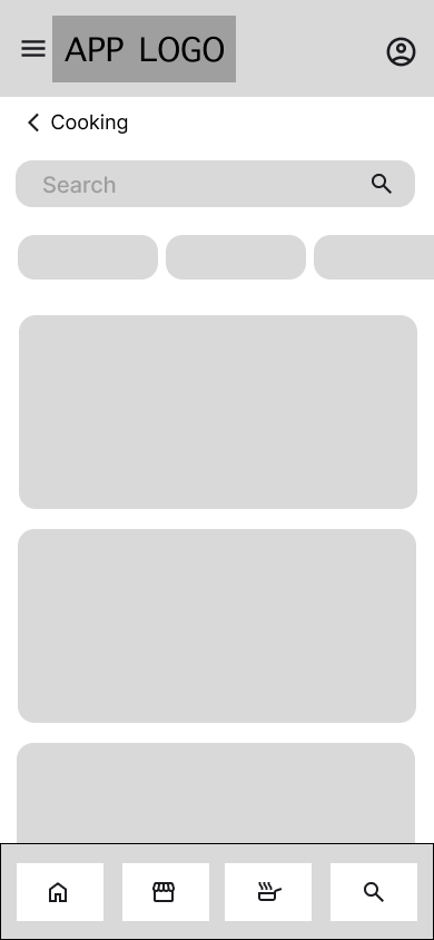
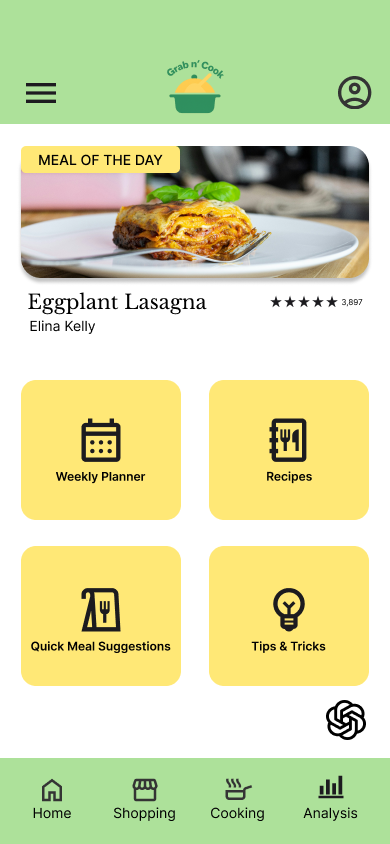
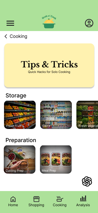
Wireframes - Lo-fi & User Flow
We evenly divided the wireframes amongst our group members. My part was the Cooking section.
Based on the research, I wanted to include three specific features:
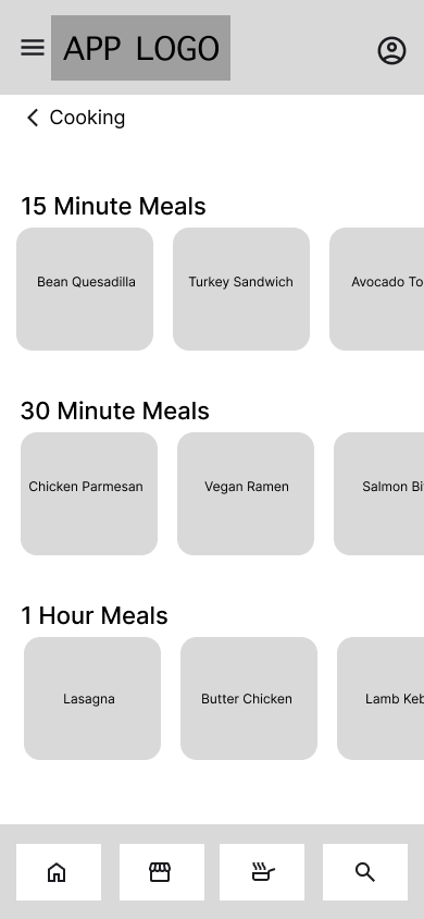
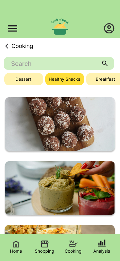
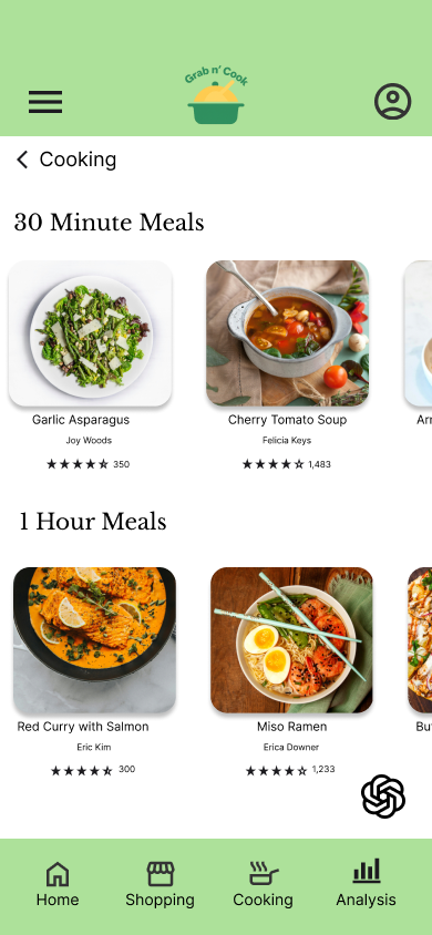
Meal recommendations: Easy to find meals with a variety of cook times
- Why: Fulfills the balance of health and time that participants prioritize; participants are able to choose a meal that fits the time they allotted to cooking from 15 mins to an hour
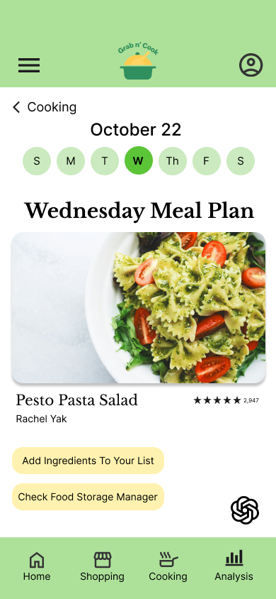
Meal planner: to help users plan out their meals in advance
- Why: Some participants can only grocery shop once a week, so a meal planner will help them plan their grocery shopping trip and budgeting accordingly
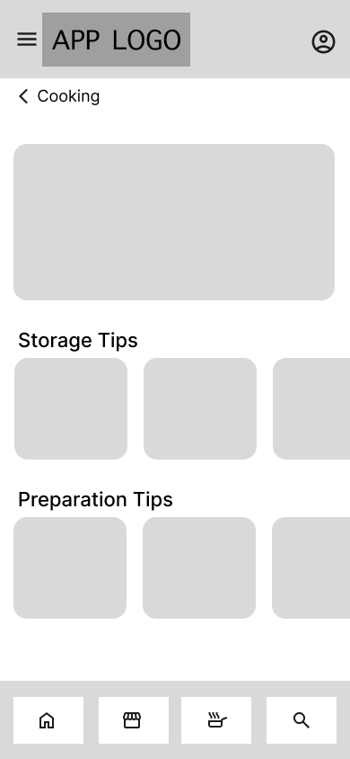
Tips for cooking (novice to advanced): Includes tips regarding storage, preparation, and other food hacks
- Why: Participants learning tips and tricks about cooking increases cooking confidence and ultimately motivate them to cook more frequently
Based on the research, I wanted to include three specific features:
Meal recommendations: Easy to find meals with a variety of cook times
- Why: Fulfills the balance of health and time that participants prioritize; participants are able to choose a meal that fits the time they allotted to cooking from 15 mins to an hour
Meal planner: to help users plan out their meals in advance
- Why: Some participants can only grocery shop once a week, so a meal planner will help them plan their grocery shopping trip and budgeting accordingly
Tips for cooking (novice to advanced): Includes tips regarding storage, preparation, and other food hacks
- Why: Participants learning tips and tricks about cooking increases cooking confidence and ultimately motivate them to cook more frequently
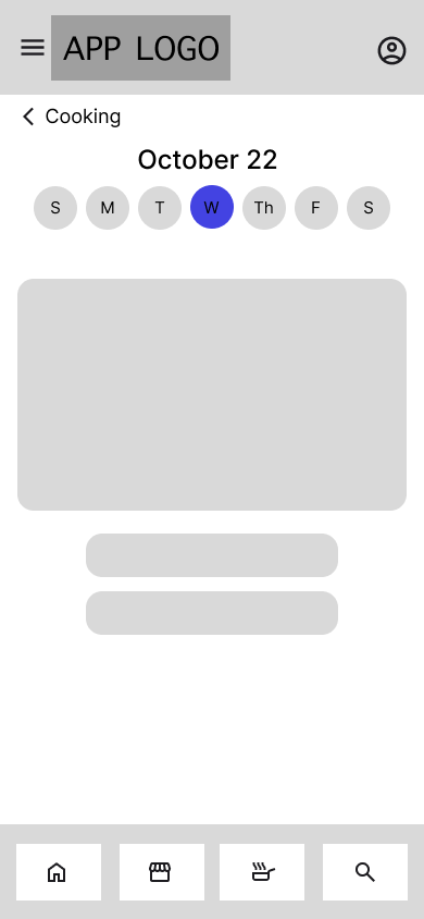
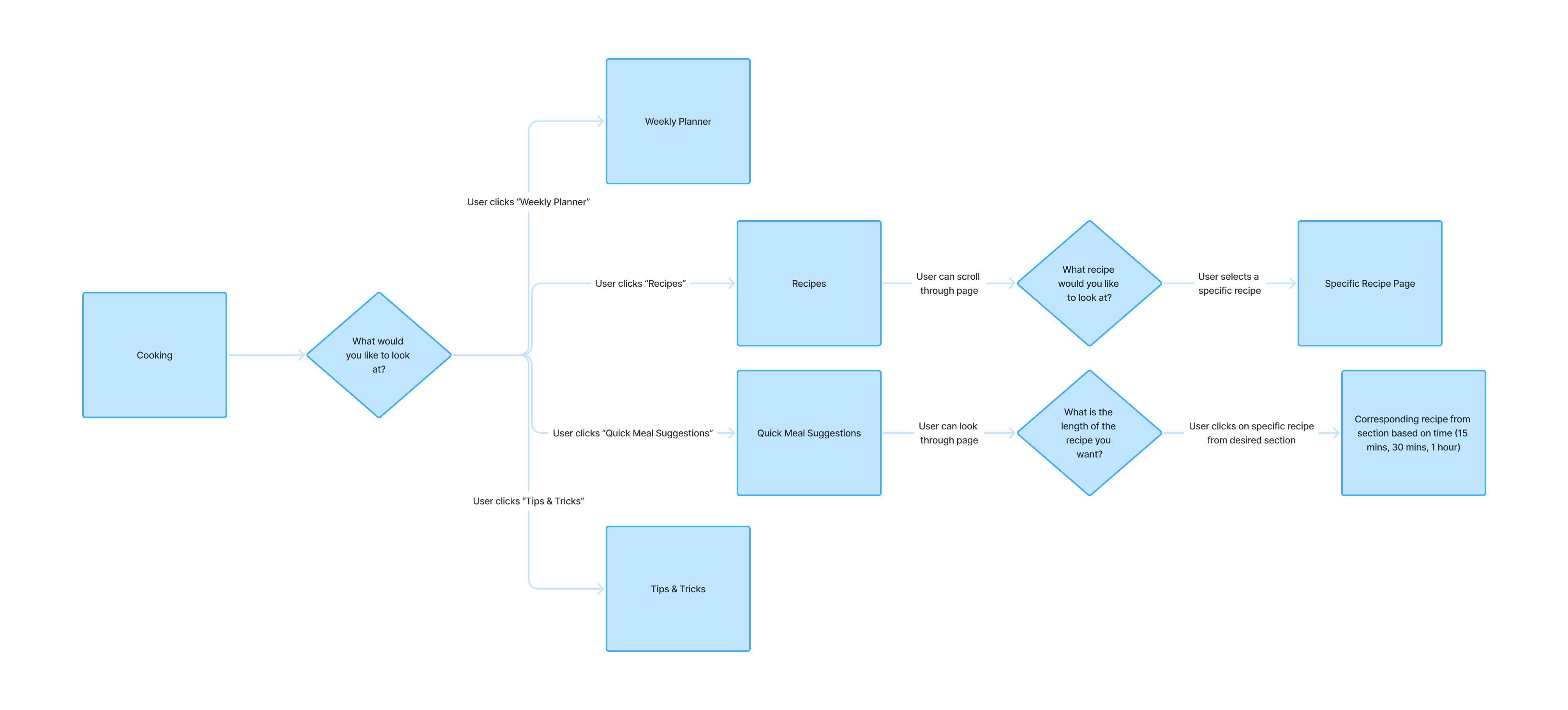
User flow diagram to understand the path a first-time user would take through the Cooking section.
Usability Testing
After the wireframes, we conducted usability tests to see how users went through the following tasks:
- Find a 30-min recipe
- Schedule a grocery shopping trip
- Set preferences and recommendations
Based on the results of the usability tests, there were thee areas that needed improvement:
- Find a 30-min recipe
- Schedule a grocery shopping trip
- Set preferences and recommendations
Based on the results of the usability tests, there were thee areas that needed improvement:
Touch Target
60%
of users misclicked UI elements because the buttons were too small
Icon Recognition
40%
of users were confused about the meaning of at least one icon in global navigation
Readability
25%
of users struggled to read text on certain frames due to the smaller font size
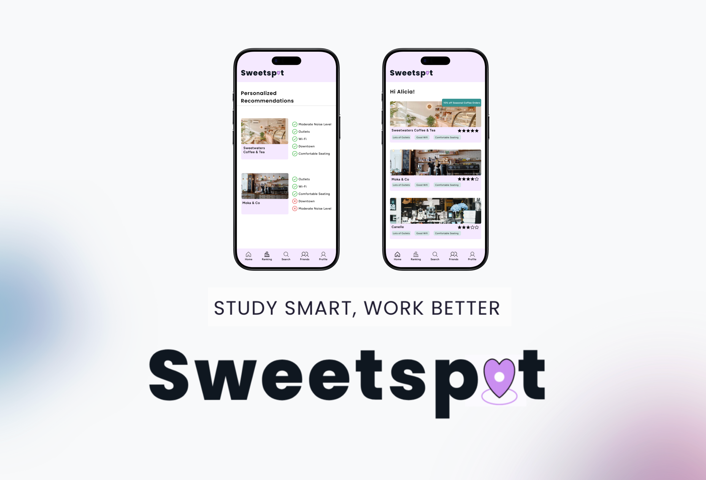
Hi-fi and Prototype
The main changes I made while making my Hi-fi frames:
Labelling on the icons on global navigation
- Why: That was an area with high confusion for users during usability testing
- Impact: Labelling it will make comprehension of the icons much clearer
Increased text size and follow visual hierarchy guidelines
- Why: Many users struggled to read the text and found the layout hard to navigate previously, so I strengthened visual hierarchy by increasing text size of headers
- Impact: Ensures more efficient and intuitive navigation of the app
Enlarged buttons, increased padding, and expanded touch targets
- Why: The size of elements was causing a problem for users during usability testing
- Impact: Reduces interaction errors and improve overall usability
Reflection
This was my first introduction to interaction design, and I found the class quite memorable. I was able to use both Figma and Axure RP to create an interactive prototype.
With more time, my next steps would be:
- Ensure the app is even more accessible: we used a color contrast checker to ensure our background and text colors were WCAG compliant, but I want to go further and use other tools such as axe and WAVE for additional feedback.
- Do more user testing: with more user testing, we will be able to understand of the flow of our app is intuitive.
See my other work!